
Tableau & Power BI - Concepts
- Gowtham V

- Jun 28, 2022
- 15 min read
Data Visualization is the representation and presentation of data that exploits our visual perception abilities on order to amplify cognition.

What is Tableau?
Tableau is a visual analytics platform transforming the way we use data to solve problems - empowering people and organizations to make the most of their data.
Why Tableau?

Tableau Types:

Tableau License Types

Tableau Desktop Basics

Build a Basic View to Explore Your Data
Tableau : connecting, analyzing, and sharing. connecting to data, analyzing it using essential charts, and creating an interactive dashboard for sharing your views.

1. Some Important Definitions and Notes :
Data granularity refers to the level of detail for a piece of data, wherever you are looking. As data becomes less granular, we might describe it as an aggregation, or as aggregated data.
Aggregation refers to how data is combined. The level of granularity or aggregation in a row or chart affects the questions we can ask of the data, and the discoveries we can make.
A field, also known as a column, is a single piece of information from a record in a data set.
Qualitative Dimensions :
A. Describes or categorizes data
B. Tells you what, when, or who
C. Slices the quantitative data
5. Quantitative Measures :
Numerical data
Provides the measurement for qualitative category
Can be used in calculations
2. Data Types:
Text or string values.

2. Discrete date and time field.

3. Discrete date field.

4. Geographic field (State, Zipcode).

5. Continuous Numeric Value.

6. Calculated filed.

3. Quick Table Calculation Overview:
A. Difference From.

ex : Current month 81921 - last month 201021 = -119100
B. Running Total.

C. Percent of total :

Current month sales 202021/grand total 923592 * 100.
D. Percent from :

ex : Feb month sales 470533/ Jan mon sales 484247 * 100
4. Calculations work with aggregation.
If we are not paying attention to how tableau automatically aggregates data, we may not get the results we want. A common example of this is ratio calculation. Here, We have profit / sales. In the view tableau automatically aggregates it, resulting in a field that looks like this.
Tableau calculates the ratio for each row then it would sum the results of these ratios. Sum the results is not very helpful what we really want here is to change the order of operations.
Ex: Sum(Profit/Sales) = 5340.17% Sum(Profit)/Sum(sales) = 618.99%

Practical Example to show how to connect the data from the data source.
Imagine you're studying data about library usage and costs worldwide. As the step in analyzing this data. you need to connect to data source an excel file, using tableau desktop. You'll do that in this activity. Look for helpful hints along the way.
Step 1 : Open Tableau desktop, and on the start page, click excel.

Step 2 : In the Open dialog box, browse to where you saved the practice file, and open it.

Step 3 : On the data source page, add the country data sheet to the "Drag sheets here" area.

Step 4 : Look at the previewed data, then click sheet 1 to open a new worksheet.

Customizing a Data Source
Get to know the functionality of your Tableau data source. Learn how to revise the properties of a data source and save those changes in a .tds file. Reconnect to the .tds file to keep working with your data without losing your changes. Share these changes with others!
Examine how changes to a data source affect your visualizations. Using live data, explore how a change to a field name in the data source can be remedied in Tableau.
* Metadata is information about the data, like field name or data type o default aggregation. We can edit this metadata from a couple of places, now we'll focus on editing on the worksheet.
Activity change and save a data source.
Scenario : You have a Microsoft excel file with data about hurricanes that you want to share with some coworkers for building workbooks in tableau. You need to make a couple of changes to the data source before it is ready to share so that your colleagues can dive right inti analysis.
Step 1 : In this example, I'm connecting to the hurricane.xslx spreadsheet, load the data and open a new worksheet.
Step 2 : I'm renaming the Late (deg) and Long (deg) fields to Latitude and Longitude.

Step 3 : Changing the category to a dimension, change the default colors.
* Drag the category field from measures to dimensions.
* Right-click category, point to default properties and click the color.
* Under select data item, click an item to select it and assign it color from palette on the right. Assign brown for category 4 and gray for category 5. Click ok.

Step 4: Set the geographic role for longitude.
* In the measure, right-click longitude, point to geographic role and click longitude.
Step 5 : Save the data source as a .tds file, close and reopen tableau desktop and open the .tds file.
* On the data menu, point to the data connection you want to save, Hurricane data (hurricane), which will have a check mark next to it, and click add to saved data sources.
* Change the file name as per your choice. Make sure you're saving the file in My Tableau Repository / Data Sources. and click save.
* On the start page, in saved data source, click new saved workbook to open it.
----------------------------------------------------------------------------------------------------------------------------------
Using Calculations: Working with Strings, Dates, and Type Conversion Functions
Do you need your dates to be specific to an analysis you're creating? Create calculations using string data fields and date fields. Combine string data, and use type conversion functions to convert a data type. Use date functions to create date-specific calculations that determine spans of time.
Activity : Manipulate Strings and Convert the Data Type
* For this activity we are developing a view that shows the sum of sales for each customer name. The new field should include text that says "Customer #", followed by Customer ID and the customer name. To do this, we need to create a calculated field that combines string text, a string field, and a numerical field.
Step 1: Create a calculated field that combines the customer ID and customer name fields.

Step 2: Add the new field to the view to the left of customer name, and adjust so all the text shows.

Activity: Create a Date Calculation
Scenario : We have the data that tells us the date of an order was placed and the date order was shipped, but our data doesn't tell how many days elapsed between them. We need to show the average days between order date and ship date for product categories, organized by department. To do this we'll use a date calculation. Upon this will build the view and adjust the aggregation type.
Step 1 : Create a days to ship field to calculate the days between ordering and shipping.

Step 2 : Create a view with days to ship on text and departments on rows.

Step 3 : Change the aggregation type to average.

Step 4 : Add categories to rows to the right of department.

Working with Date Fields: Custom Dates
Make date fields behave exactly the way you want, every time! Learn how to use custom dates to simplify a time series analysis that you find yourself doing frequently. Create custom dates that are automatically drilled down to the continuous date value you want. Or, use custom dates that deliver only the discrete date part you were looking for. Build a hierarchy from the custom dates to control what happens when users drill up or down.
Scenario : We're preparing a data source for our teams to use. They generally do analysis by looking at discrete years and quarters. and they don't need to drill down beyond that. Our goal is to create two custom date parts and assemble those into a hierarchy.
Step 1: Create a discrete quarters custom date field, and use it to show quarterly sales as a bar chart.
* From the data pane, click the order date drop-down menu, point to create, and click custom date.

* Name the custom date order date (Discrete Quarters).

3. From the detail drop-down list, select quarters.
4. Select the date part radio button, and click ok.
5. Drag sales to rows, then drag order date (Discrete quarters) to columns.
6. Change the mark type to Bar.
Replicate the above steps and create discrete years.
*** Create hierarchy with the custom date fields, and replace discrete quarters in the view.
--> In the data pane, drag the order date (discrete quarters) field on top of the order date (discrete years) field to create hierarchy.
--> Name the hierarchy order date (Discrete years to quarters).
Table Calculations
A table calculation is a transformation you apply to the values in a visualization. Table calculations are a special type of calculated field that computes on the local data in Tableau. They are calculated based on what is currently in the visualization and do not consider any measures or dimensions that are filtered out of the visualization.
The basics: addressing and partitioning
* When you add a table calculation, you must use all dimensions in the level of detail either for partitioning (scoping) or for addressing (direction).
* The dimensions that define how to group the calculation (the scope of data it is performed on) are called partitioning fields. The table calculation is performed separately within each partition.
* The remaining dimensions, upon which the table calculation is performed, are called addressing fields, and determine the direction of the calculation.
-------------------------------------------------------------------------------------------------------------------------
Ex: 1 -- Table (across)
Computes across the length of the table and restarts after every partition.
For example, in the following table, the calculation is computed across columns (YEAR(Order Date)) for every row (MONTH(Order Date)).

Ex: 2 ---> Table (down)
Computes down the length of the table and restarts after every partition.
For example, in the following table, the calculation is computed down rows (MONTH(Order Date)) for every column (YEAR(Order Date)).

Ex: 3
Table (across then down)
Computes across the length of the table, and then down the length of the table.
For example, in the following table, the calculation is computed across columns (YEAR(Order Date)), down a row (MONTH(Order Date)), and then across columns again for the entire table.

Ex: 4 - Table (down then across)
Computes down the length of the table, and then across the length of the table.
For example, in the following table, the calculation is computed down rows (MONTH(Order Date)), across a column (YEAR(Order Date), and then down rows again.

Ex: 5 -- Pane (down)
Computes down an entire pane.
For example, in the following table, the calculation is computed down rows (MONTH(Order Date)) for a single pane.

Ex: 6 -- Pane (across then down)
Computes across an entire pane and then down the pane.
For example, in the following table, the calculation is computed across columns (YEAR(Order Date)) for the length of the pane, down a row (MONTH(Order Date)), and then across columns for the length of the pane again.

Ex: 7 Pane (down then across)
Computes down an entire pane and then across the pane.
For example, in the following table, the calculation is computed down rows (MONTH(Order Date)) for the length of the pane, across a column (YEAR(Order Date)), and then down the length of the pane again.

Ex: 8 - Cell
Computes within a single cell.

Specific Dimensions
Computes only within the dimensions you specify.
For example, in the following visualization the dimensions, Month of Order Date and Quarter of Order Date, are the addressing fields (since they are selected), and Year of Order Date is the partitioning field (since it is not selected). So the calculation transforms the difference from each month across all quarters within a year. The calculation starts over for every year.
Note that if all dimensions are selected, then the entire table is in scope.

----------------------------------------------------------------------------------------------------------------------------------------
Question 1: The annual sales dashboard to regional sales managers. You need to show the profitable records as a percent of total sales for each sub-category. Use a calculated field and apply a table calculation to show this in the view.
Step 1 : Create a bar chart showing number of records against category and sub-category, broken down by order date as a discrete year.

Step 2 : Create a calculated field to evaluate each record as a profit or loss.
Profit Or Loss : IF [Profit] > 0 THEN "Profit" ELSE "Loss"END
Step 3 : Apply a table calculation to Number of Records that shows each cell in the table as a percentage of total.
Step 4 : Use the profit or loss calculation to add color to the view.
Step 5 : Using the sum(Number of records) table calculation, label the marks in the view.

Using Sets to highlight data
Sets allow you to examine activity in your data that may not be obvious. Use sets to highlight parts of your data for more focus. Create a set from the data pane or by selecting marks in the view. Use a set as a filter, or combine sets, and re-use sets as needed.
Scenario : You own a business and would like to see how well the products in your inventory are selling. Creating a combined set to help you see which items are among the highest sold yet bring in the lowest profit.
Step 1 : Build a scatter plot comparing sales and profit by item.
(From measures - Drag profit to rows and sales to columns), (From dimension drag item to detail on the marks card).

Step 2 : Create a set of the Top 100 Items sold.
(Under dimensions right click Item, Select create, and then click set),
(Name the set "Top 100 Items sold").
(Click the Top tab, and then select by field).
(Select Top in the drop-down menu, and enter "100" next to Top).
In the drop-down menu under Top, change category to Sales.

Step 3 : Create a set of the bottom 100 items by profit.
(Under dimensions right click Item, Select create, and then click set),
(Name the set "Bottom 100 by profit").
(Click the Top tab, and then select by field).
(Select Bottom in the drop-down menu, and enter "100" next to bottom).
(Next to bottom, enter the value 100).
(In the drop-down menu under bottom, change category to profit).
(confirm that sum is selected).
Step 4: Combine the Top 100 and Bottom 100 sets.
1. In the data pane, multi-select both the bottom 100 and Top 100 sets.
2. Right-click your selection and choose create combined set.
3. Name the set "Top and bottom 100 items".
4. Select shared members in both sets.
5. Click ok.

Step 5 : Use the combined set to show in/out by color.
From the sets, drag the Top and Bottom 100 Items set to color on the Marks card.
Using Context Filters to Limit Scope
Use a context filter when you want to specify a context for another filter in your view, such as a Top N filter. For example, you could use Region as a context filter to see the top-10 selling products per region rather than across a whole data source. Context filters can help improve performance, too, by limiting the scope of a query to the specified context.
Using Level of Detail Expressions
While creating charts and crosstabs in Tableau, the view is gradually built by what you place on rows and columns. This placement determines the level of detail you’re able to see in your worksheet view. This is a powerful tool, but what if you wanted to use a dimension you haven’t placed in the view?
* Level of detail expressions allow you to create calculations that exist at different levels of detail than what is shown in the view.
* Level of detail refers to the Aggregation or Granularity of the data.
Tableau (Fixed - Include - Exclude) Concepts : https://manage.wix.com/dashboard/539c4edc-3a06-491f-927a-17915272703d/blog/96704f3c-dfcf-41e7-9435-35b97ae41392/edit
Power BI
Prerequisites
Before proceeding with this tool, you should be familiar with Microsoft Excel, data modeling, and have some knowledge of DAX language.
--------------------------------------------------------------------------------------------------------------------------------------
•Microsoft Excel: Microsoft Excel is a spreadsheet developed by Microsoft for Windows, macOS, Android and iOS. It features calculation or computation capabilities, graphing tools, pivot tables, and a macro programming language called Visual Basic for Applications.
-------------------------------------------------------------------------------------------------------------------------------------
* Spread Sheet : A spreadsheet is a computer application for computation, organization, analysis and storage of data in tabular form. Spreadsheets were developed as computerized analogs of paper accounting worksheets. The program operates on data entered in cells of a table
----------------------------------------------------------------------------------------------------------------------------------------
•Data Modeling: Data models are made up of entities, which are the objects or concepts we want to track data about, and they become the tables in a database. Products, vendors, and customers are all examples of potential entities in a data model. Entities have attributes, which are details we want to track about entities—you can think of attributes as the columns in a table. If we have a product entity, the product name could be an attribute.
*** ex:

•DAX language (Data Analysis Expressions): Data Analysis Expressions (DAX) is a programming language that is used throughout Microsoft Power BI for creating calculated columns, measures, and custom tables. It is a collection of functions, operators, and constants that can be used in a formula, or expression, to calculate and return one or more values.
* What is DAS used for?
Calculated Columns
* Create New Columns On a table.
* Method for connecting disparate data source with key columns.
Calculated Measures.
Create Dynamic aggregations.
Ratios / Percentages.
Time Intelligence Calculations.
Complex Relations.
Calculated Tables.
Create a new table derived from another table.
Can be used to create a date table when one doesn't exist already.
What is Power BI ?
•Power BI is a Business Intelligence and Data Visualization tool for converting data from various data sources into interactive dashboards and analysis reports.
•Power BI offers cloud-based services for interactive visualizations with a simple interface for end users to create their own reports and dashboards.
•Power BI is simple to use. Anyone with previous Excel experience, creating reports, charts, diagrams etc. can easily switch to Power BI. Its’ highly intuitive and Office-like interface makes it more user friendly to the broader audience. In just a few steps you can grab some data, do some cleaning, cleansing and create meaningful visualizations

The Parts Of Power BI
• Power BI consists of several elements that all work together, starting with these three basics:
1. A Windows desktop application called Power BI Desktop.
2. An online SaaS (Software as a Service) service called the Power BI service.
3. Power BI mobile apps for Windows, iOS, and Android devices.
These three elements—Power BI Desktop, the service, and the mobile apps—are designed to let you create, share, and consume business insights in the way that serves you and your role most effectively.
Power BI Desktop?
• Power BI Desktop is an application that you download and install for free on your local computer. Desktop is a complete data analysis and report creation tool that is used to connect to, transform, visualize, and analyse your data.
• It includes the Query Editor, in which you can connect to many different sources of data, and combine them (often called modelling) into a data model. Then you design a report based on that data model. Reports can be shared with others directly or by publishing to the Power BI service.

How to use
•Install the application
•Sign In
•Launch and Explore UI
•Connect to data
•Import data from Excel
•Transform data
What its purpose is?
•Power BI is a suite of tools, let’s discuss

•Power Query: It can be used to search, access, and transform public and/ or internal data sources.
•Power Pivot: It is used in data modelling for in-memory analytics.
•Power View: You can analyse, visualize, and display data as an interactive data visualization using Power View.
•Power Map: It brings data to life with interactive geographical visualization.
•Power BI Service: You can share data views and workbooks which are refresh-able from on-premises and cloud-based data sources.
•Power BI Q&A: Ask questions and get immediate answers with natural language queries.
•Data Management Gateway: By using this component you get periodic data refreshers, expose tables, and view data feeds.
•Data Catalog: Users can easily discover and reuse queries using the Data Catalog. Metadata can be facilitated for search functionality.
Power BI’s Architecture
•Power BI’s architecture has three phases. The first two phases partially use ETL (Extract, Transform and Load) to handle the data.:

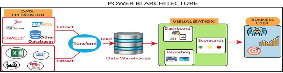
Power BI – Supported Data Sources
•There are more than 100 different data sources available in Power BI. You can consolidate data from a variety of databases, files, online pages, pdf extracted data files, and online source, etc. into one report, which can save office workers a lot of time – it’s a real “plug-and-play” application
Data Sources Example’s (These are the few examples of data sources)

Power BI Desktop vs Power BI Service
POWER BI Desktop
* Desktop Version.
* Data Analysis and report creation tool.
* Includes Power Query Editor
* 100% Free.
Power BI Service
* Cloud-based version
* Light Report Editing. (Reports can be edited in power BI service, but not to the full extent as desktop).
* Share and distribute reports.
-----------------------------------------------------------------------------
Please Note : Power BI Pro (Paid Version)
Exclusive Features:
Publish and share across the power BI cloud platform
Mobile App
Collaborate with other power BI users.
Power BI Desktop UI
Power BI Desktop U

Report View : In this view, we can create reports and visuals.
Data View : In the data view, we can see the data used in the data model associated with the report.
Model View : In the model view, we can see and manage the relationships among tables in the data model.
Canvas Area

In the canvas area in the middle is where visualizations are created and arranged.
--------------------------------------------------------------------------------------------------------------------------

In the filters pane you can filter data visualizations.
--------------------------------------------------------------------------------------------------------------------

In the visualization pane you can add, change or customize visualizations.
------------------------------------------------------------------------------------------------------------------

The fields pane shows the available fields. We can drag these fields onto the canvas, the filter pane or to the visualizations pane to create or modify visualizations.
--------------------------------------------------------------------------------------------------------------------------------------
How to add data in Power BI Desktop:
1.In Power BI, in the navigation pane, click Get Data.

2. In Files, click Get

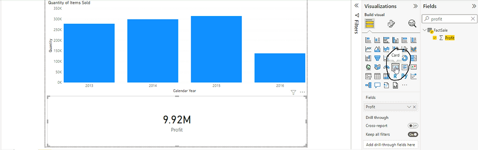
*** Your First Visualization.
In this example, I have already loaded FactSale.csv excel file. Using the Get data button,
Perform the following actions.
1. Under the fields, search for Quantity and select the attribute. Immediately a bar chart will be created in the canvas.

2. Using the get data button, I'm loading the Dimdate.csv excel file.
3. In the model view create a relationship between Fact sales (Invoice Date Key) and Dimdate Date.

4. In the report view select the existing bar chart and the select calendar year from dimdate in the fields pane.

5. In the visualization pane, drag calendar year to Axis rather than value.

6. Select the profit field from the Factsale. A bar chart will get created automatically. Note that you can use the search function in the fields pane to easily locate columns.
7. Now I'm loading the 3rd file, Dimemployee.xlsx. Using excel button on the top menu.
8. Creating a relationship between Factsales - Salesperson Key attribute and Dimemployee Employee key.

9. In the report view add a slicer. Add the employee field to slicer, and change the slicer from list to dropdown using the arrow on the top right in the slicer.
Slicer. 2. List to Dropdown.

* Transforming Data:
* Dataset may contain:
1. Columns you don't need.
2. Inconvenient and inconsistent formatting.
3. Extra Characters.
4. Blank Rows.
* Cleaning Data.
When you loaded the data, this preview pop-up screen appeared. You will use the power query editor which is a tool that allows us to edit the data prior to loading it. You can use it to format the dataset and decide what gets loaded.

The power query loads in another screen shown here and uses a language called M.
Note : Power query editor open in a separate window, we need to close it to go back to our report.

* Drilling down and filtering
I'm connected to Dimdate excel data source.
Scenario : Create a hierarchy that starts with Year, goes on to the Quarter, then the moth name and ends with date key.
If the drag functionality isn't working, you can right click dimdate year in the field panes and select "Create hierarchy" From there you can right click the necessary fields and select Add to hierarchy.
Rename the hierarchy to Date hierarchy.

Before creating this hierarchy. I was using short-month attribute for my bar chart. Now will replace the shortmonth Axis value of the column by the date hierarchy.
Before

After

Now we can use the drill controls in the top right corner of the visual to explore the different levels. Click the single down arrow to drill down.

will be continued..................................................................................................


Comments